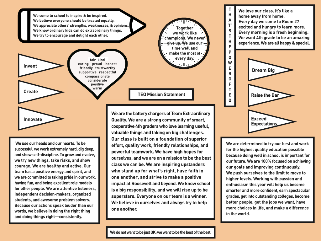
 My students and I just completed our class mission statement, and I decided to try a different format this year. Rather than present our ideas as a series of paragraphs, I designed the document to look like the front wall of a classroom. The text was fit inside a whiteboard, two bulletin boards, a clock, a flag, and other "classroom-themed" shapes. As much as possible, the meaning of the text matched the object in which it was placed. For example, the words "we use our time well and make the most of every day" were put in the clock. My hope is that this novel format will resonate with my students and give our ideas greater meaning.
Click here to see the full-sized version of our new class mission statement.


